Context and diagnosis
Dante AI sells a platform that turns any business into a conversational agent. The product worked, to a point. Fast and cheap as the category exploded, it won early traction through speed of shipping. But the pace came out of a codebase and design assembled rather than systematised: a collection of parts added as the product grew, never coherently rebased. By the engagement's start, the technical depth had caught up with that pace.
Two roots, operating in parallel.
The first root was behavioural. Six percent of visitors who clicked Sign Up ever reached the point of embedding the agent on their own site and having a real customer conversation with it. The other ninety-four percent stalled somewhere between account creation and a working agent. Users got in, faced an empty canvas, and left. Most had never built an AI agent before, and an empty canvas to a first-time builder reads as a lot of work ahead, not a lot of value behind. The product was asking for effort before it had demonstrated anything worth that effort.
The second root was structural. No coherent design system. No consistent navigation. No shared component base. Every surface had been built as its own thing, with the edges smoothed over each release rather than re-founded on a base. The consequences compounded. Features that existed were hard to find. Team Management was the canonical example, mentioned repeatedly in support tickets because users didn't know it was there. Features that existed but were underdeveloped relative to their demand got no weight in the hierarchy. Lead Generation had clear demand in research and thin engagement in product because the navigation gave it nowhere to live. And every new feature rollout carried engineering cost that compounded, because each one had to invent its own components rather than inherit them: new button variants, new dropdowns, new empty states, each built from scratch with the workarounds that came with that. The cost of shipping anything new kept climbing, because there was no base to add it to.
Two roots, two fixes, the same shape at the level of intent: put the user in front of real value before asking for effort, and put the product on a coherent base before asking it to grow. The behavioural fix carried endowed progress and its siblings (labor illusion, psychological ownership, peak-end reframing), applied at the moments where value needed to be felt. The structural fix was a tokenised design system with dark mode from the foundation, an information architecture rebuilt to absorb features that didn't yet exist, and a component library that made the next feature cheaper to build than the last.
The engagement ran from June 2025 to February 2026 and focused on conversion and activation. Upgrade logic and retention were scoped and handed off as a follow-on plan, not shipped inside the engagement. What follows is the work that shipped.
Research
The opening weeks went to user sessions, logs, and market work, not Figma.
The analytics stack moved through Amplitude to Mixpanel during the engagement, with Clarity for session replay and Optibase for experiment orchestration. Daily log review covered three sources: inbound support tickets, the in-product support chat, and the homepage widget where prospects interacted with Dante on its own marketing site.
A note on the two widgets this case will keep referring to. The homepage widget was Dante's own chatbot embedded on dante-ai.com. Visitors interacted with it before signing up, asking about what they wanted from a product like Dante. The 60-second agent was a different surface, introduced during this engagement: the new signup-flow mechanism that takes a user's URL, trains an agent on it in under a minute, and lets the user try their own agent before committing. The two look similar on the outside but play different roles in the case.
Research ran alongside the support manager. I sat in on support calls, worked through the logs with her at the end of each day, and used her direct contact with stalled sign-ups as a running feed of language at the point of confusion. The setup captured language at the moment of friction, not weeks after.
An internal analytics dashboard came out of the first weeks of diagnostic work: a focused view of first-run funnel behaviour that the core product didn't surface, used to argue the redesign internally.
Four research streams shaped the direction.
First, the sign-up funnel in analytics. The starting funnel was clear on arrival. 15% of visitors who reached the signup page clicked Sign Up. Of those, 30–40% finished setup and saw a deployed chatbot. Two stages were underperforming, not one: the decision to sign up at all, and the decision to push through setup. The signup drop was explainable in analytics alone: the breakpoint was motivation, not UX. There was no reason yet to commit. This is why the 60-second agent had to come before the signup form, not after.
Second, the homepage widget as a research instrument. The widget was placed directly in the hero of dante-ai.com, not only as the bottom-right bubble trigger most widgets default to. That placement let me experiment with welcome messages and quick-start options to see what framings brought visitors into a conversation. What they then asked the widget revealed what users wanted from products in the category. Two demand signals recurred: voice AI (advertised by Dante but not fully polished at the time) and lead generation, an existing feature under-engaging relative to the demand visible here. The widget was upstream of positioning. It didn't validate copy; it surfaced hypotheses the A/B tests then tested.
Third, positioning A/B tests on the hero. The hero cycled through angles fed by the widget (outcome-led, feature-named, comparative, risk-reversal) across four progressively larger sample rounds, reaching ~1,931 users in the final round. Customer Service AI That Actually Works in 60 Seconds won at 30.53% conversion. Give Your Team Superpowers held at 21.58%. Fear-based, problem-framed messaging landed at 13.32%. The hero doubled as a research instrument in itself: widget conversations fed positioning hypotheses, and the hero validated them at scale. The loop closed continuously.
Fourth, session replays inside the product. Replays were targeted at in-product behaviour: which features were most used, how users moved between features, where friction appeared inside specific features, which features looked useful but weren't delivering engagement. Once the 60-second agent shipped, replays were added there too to watch for friction in the new flow.
Underneath the positioning wins sat a single audience diagnosis. Dante's addressable customer was not the early adopter. It was the burned skeptic. Business owners who had tried an AI chatbot in 2022 or 2023, watched it fall short, turned it off, and are now cautiously researching again. The competitive frame for that audience is not AI or no AI. It is our prior chatbot experience vs Dante. Every positioning winner above was the same thesis proved differently: Actually Works answers "doesn't really work," 60 seconds answers "took forever to set up," transparent pricing and risk reversal answer "got stuck in a contract." Without the diagnosis the wins read as copy that happened to work. With it, they read as one thesis proved several ways.
The diagnosis pointed at a clear shape. Value had to arrive earlier in the journey (at first-run, at feature encounter, at feature use), so users formed a working mental model of the product before they were asked for commitment. The direction was clear from here. The rest of the engagement was building against it.
Ideation
Ideation on this engagement moved through questions, not directions. The design wasn't a choice between two or three big paths. It was a series of small architectural decisions, each with several candidate answers, each narrowing the final shape. On the question of activation specifically, three candidate answers got real exploration. Two were rejected. The reasoning is the point.
Direction A: tighten the config step
Fewer fields, better empty states, the kind of guided onboarding tour the category ships through tools like Userflow. Two days of wireframes before I killed it. The problem was surface-level. The empty canvas was still the first thing the user saw. The best possible version of this direction was a user who bounced a few minutes slower. Rejected.
Direction B: seeded sample project
Sign the user up, drop them into a pre-populated sample project, let them see a working agent before building their own. This got further. But the demo was about a made-up company, not the user's company. The mental model of "what this product does for me" never fully formed. Users still stalled at the transition from sample to their own data. Rejected.
Direction C: reverse the sequence (shipped)
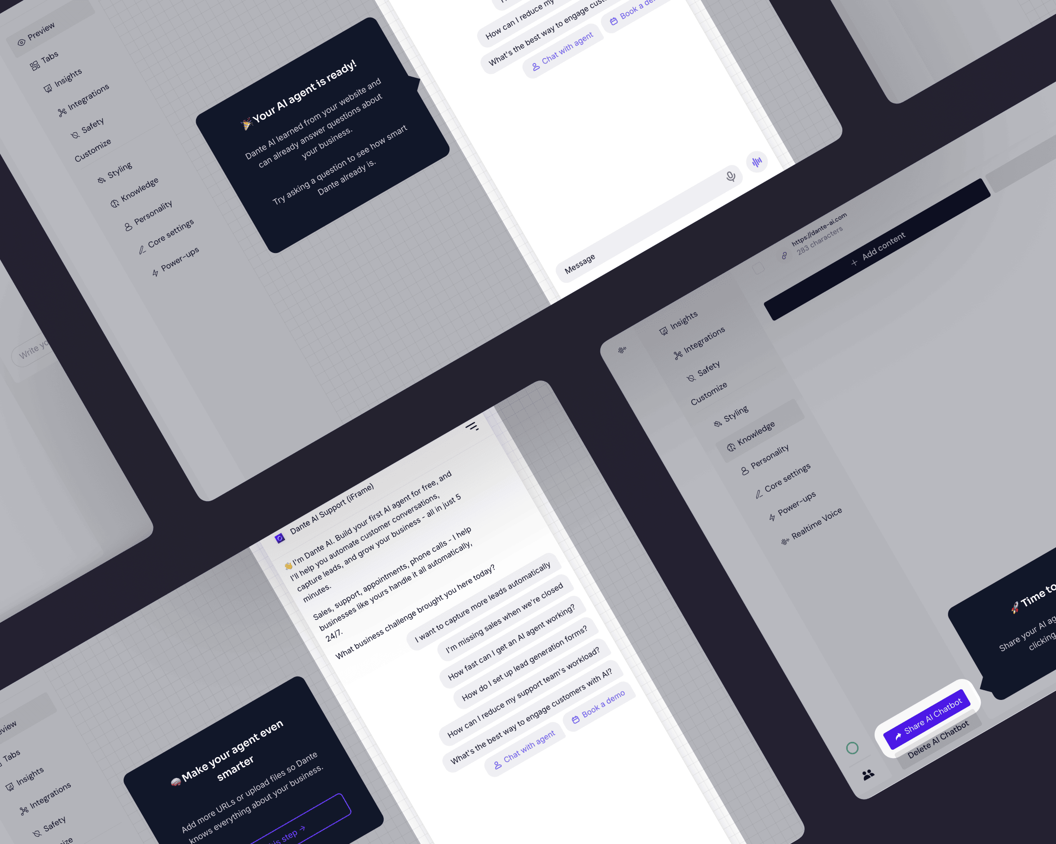
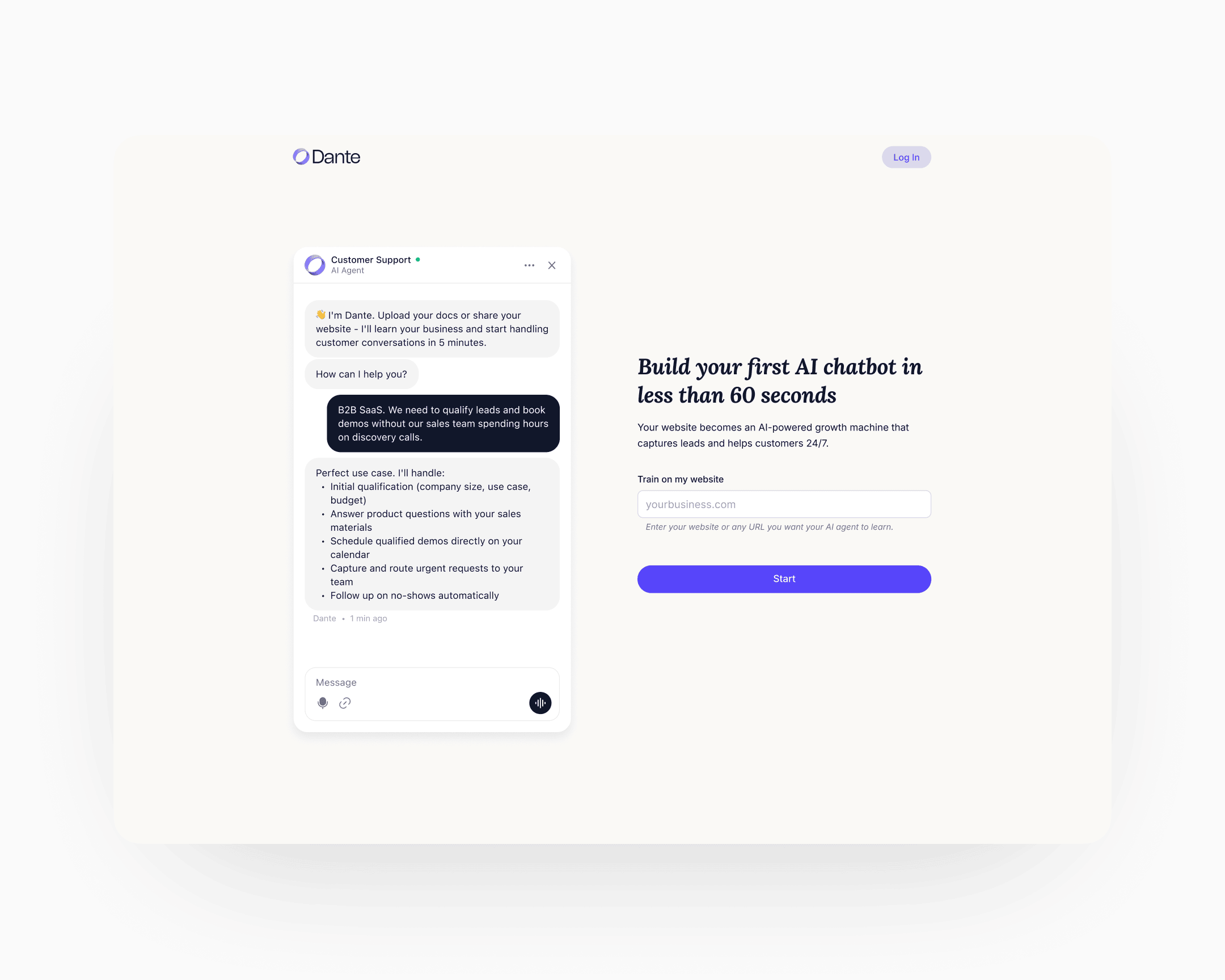
The website asks the visitor for their own URL. Dante indexes the site in the background, trains an agent on the visitor's actual business in under sixty seconds, and shows the agent answering real questions about the visitor's company. Only then does the UI offer the Sign Up affordance, reframed as Claim this agent in the initial conception.
Direction C meant rebuilding the home page, the sign-up flow, and the first-run experience as one continuous sequence rather than three separate screens with three separate jobs. The engineering cost was real. The behavioural claim was that once the user had watched their own agent work, they would form the mental model of the product doing something for them before committing. That claim was testable. The test moved 6 to 25.
The decisions inside Direction C
Direction C set where to go. The design came from the chain of decisions inside it: some measured, some judged, each argued against the same root cause.
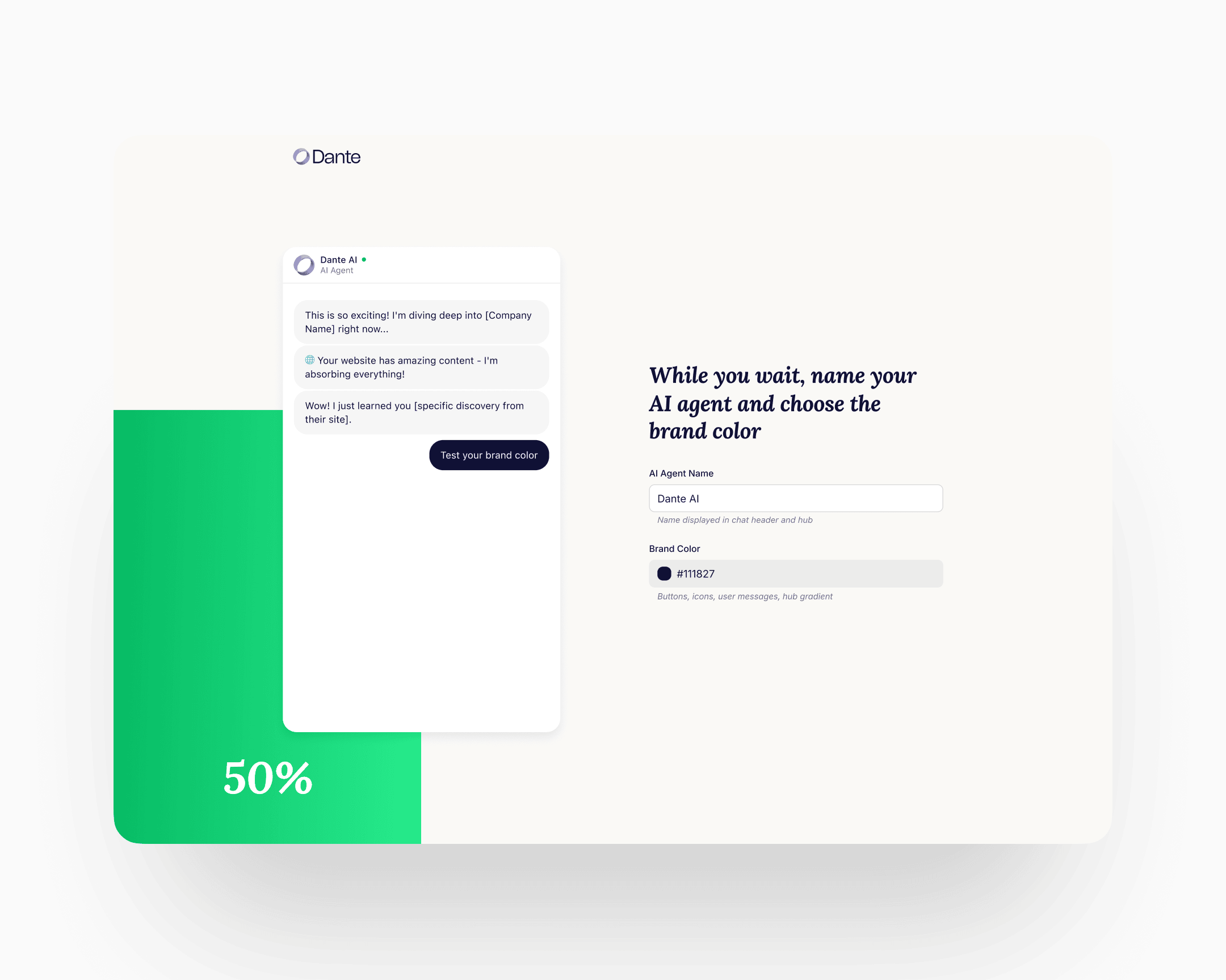
Labor illusion built from two signals, not one. The training wait was never a single design problem. A progress bar alone answers how much longer but says nothing about whether real work is happening. Streamed contextual chat alone proves the agent is reading the site but gives no sense of duration. The flow carries both. The progress bar holds percentage and pace. The streamed chat begins talking about the visitor's own product within the first few seconds: specifics that could only come from reading their site. Neither signal holds the moment on its own. Together they turn a sixty-second wait into the first piece of value the product delivers.
Specific content as target, generic as scaffolding. The first prototype ran generic streamed text because the indexing pipeline wasn't yet returning real business context from the visitor's homepage. The target was always specifics: what the business actually does, surfaced from a deep pass over the homepage inside the same sixty-second window. That window was a hard budget covering three jobs in sequence: index the page, generate the contextual output, and stand up a working agent. The decision wasn't whether to go specific. It was when the indexer could keep pace with the stream.
Copy iteration across two CTAs. Two copy surfaces carried disproportionate weight: the hero entry CTA and the post-conversation conversion CTA. Each ran through several rounds.
The hero entry cycled Start the Magic → Build my agent → Start now. Magic read as vague. Build my agent carried implied effort at the moment the product is supposed to do the work for you. Start now won on immediacy. It names the action, not the outcome, at the moment the visitor has nothing to lose.
The post-conversation CTA cycled Claim my agent → Get started → Send verification link. Claim my agent carried the psychological-ownership framing the flow had been built around, but in practice it read as a second funnel entry rather than a close. Get started tested as too generic. Send verification link won: it names the exact next mechanical step, matches what the user is actually asking for at that moment (an account they can return to), and closes cleanly without pretending to be a new beginning.
Minimum-viable signup: one click, or one field. Three fields would have been too many. Two would have been too many. The shipped signup is either one click through Google SSO or one field: email only. No name. Omitting the name field was deliberate. By the time the visitor has watched their own agent work, asking for anything beyond the identifier required to send a verification link reads as a second gate. Name and profile data collect themselves later, through use.
A persistent guided widget, not a landing page. After signup, the user does not land on a configuration page, an embed screen, or a dashboard in the conventional sense. A persistent widget sits at the top of whatever surface the user opens and walks them through three jobs in sequence: make the agent work correctly, make it look the part, deploy it. The widget stays until all three are complete. The design logic is about muscle memory, not just completion. Each step teaches the shape of the product through the act of doing it, so that by the time the agent is live on the user's site, the user has already built the mental model of the core workflow they'll return to.
And the rest of the ideation. Activation was one of several surfaces. Alongside it, the ideation covered the website flow and positioning, the in-product information architecture, a new chatbot UI with multi-chat support, a measurement scheme distinguishing implicit from explicit CSAT and resolution rate, a mobile treatment for the whole product, an upgrade-logic design (handed off at engagement end), and the cancellation flow. Each touched a different behavioural lever. The next section covers what shipped.
Execution
Eight named streams shipped over the engagement. Each had its own diagnostic, its own design choices, its own rollout. They share one thread: the tokenised design system sitting underneath them, which is why the pace was what it was.
The website and positioning
The positioning shifted from "chatbot tool" to a broader framing around business outcomes, with the hero carrying the argument. The hero was treated as a running experiment: many rounds of A/B, angles ranging from outcome-led to comparative to loss-aversion.
One winning angle came directly from the homepage-widget research: visitors were asking about voice AI often enough that the positioning Your customers can call your website became a strong test candidate. It resonated, and conversions lifted.
The bigger move was making the 60-second agent the hero's primary affordance. The hero pulled visitors straight into the agent flow rather than pitching at them. A visitor who entered their URL and watched an agent train on their site built emotional attachment to a bot already built on their page. That pre-commitment attachment turned the activation pattern into a marketing pattern. Organic website conversion stabilised above twenty percent. On the strongest traffic cuts it reached thirty.
The home page, sign-up flow, and first-run experience were rebuilt as a single continuous sequence. The 60-second agent is the centre of gravity below.
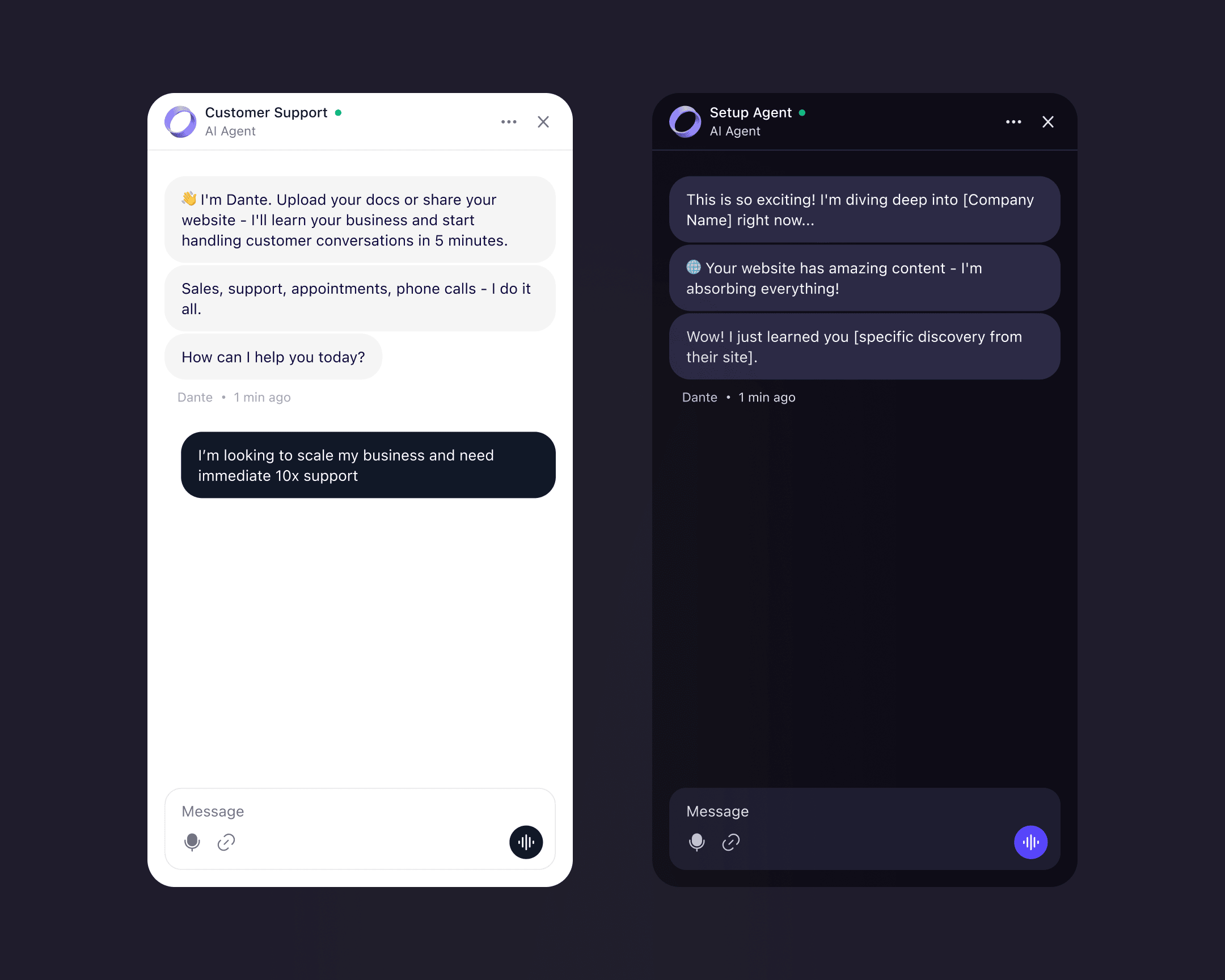
The 60-second agent
Three steps, one continuous flow from first visit to first external conversation.
Step 1: the agent page
A dedicated page, separate from the home. The URL input sits on one side, with a chat preview alongside showing the same agent trained on different content types: a YouTube video, a web page, a Google Sheet, a document. The preview's job is to demonstrate the range. By the time the visitor enters their URL, they've already seen what the agent can do.
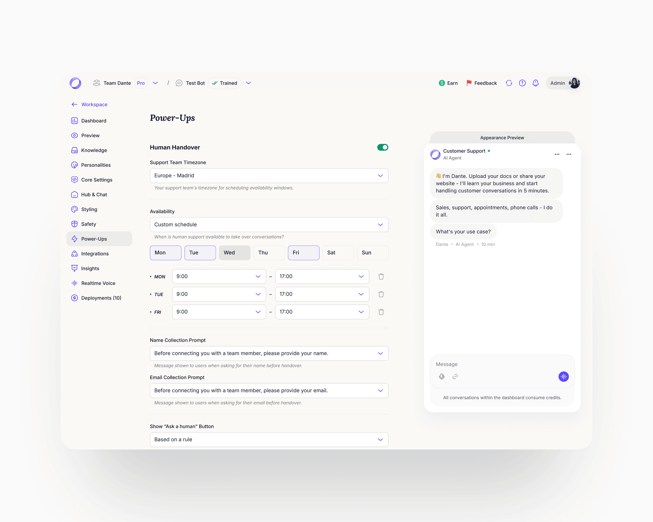
Step 2: name and accent
The agent trains in the background. The progress bar and the streaming context run alongside, showing the training is real. The foreground action is personalisation: the user gives the agent a name and chooses an accent colour. By the time the sixty seconds end, the agent carries the user's name and colour. That is the first micro-commitment the flow asks for, and it shifts the agent from "an agent" to "my agent" before any of the larger commitments arrive.
Step 3: the conversation
The user can ask the agent anything about their business. The agent answers using the content it just read. Typical first questions: What do you sell? Who is your biggest customer? What's your return policy? The mental model shifts from "generic AI chatbot" to "agent that already knows my company."
Only at this point does the account affordance surface. One click through Google SSO, or one email field with the button Send verification link. After verification, the user lands in their account with the named, coloured, trained agent already there. The persistent guided widget takes it from there.

In-product architecture
The product Dante had when I started was a scrappy accumulation of features with a flat, inconsistent navigation. Team Management was buried. Analytics was per-chatbot only. Deployments were a byproduct of Share clicks rather than a managed object. Personalities were a field inside a settings page. Billing was an undiscoverable, broken flow. The navigation couldn't scale. There was no place for the next feature to go without adding chaos.
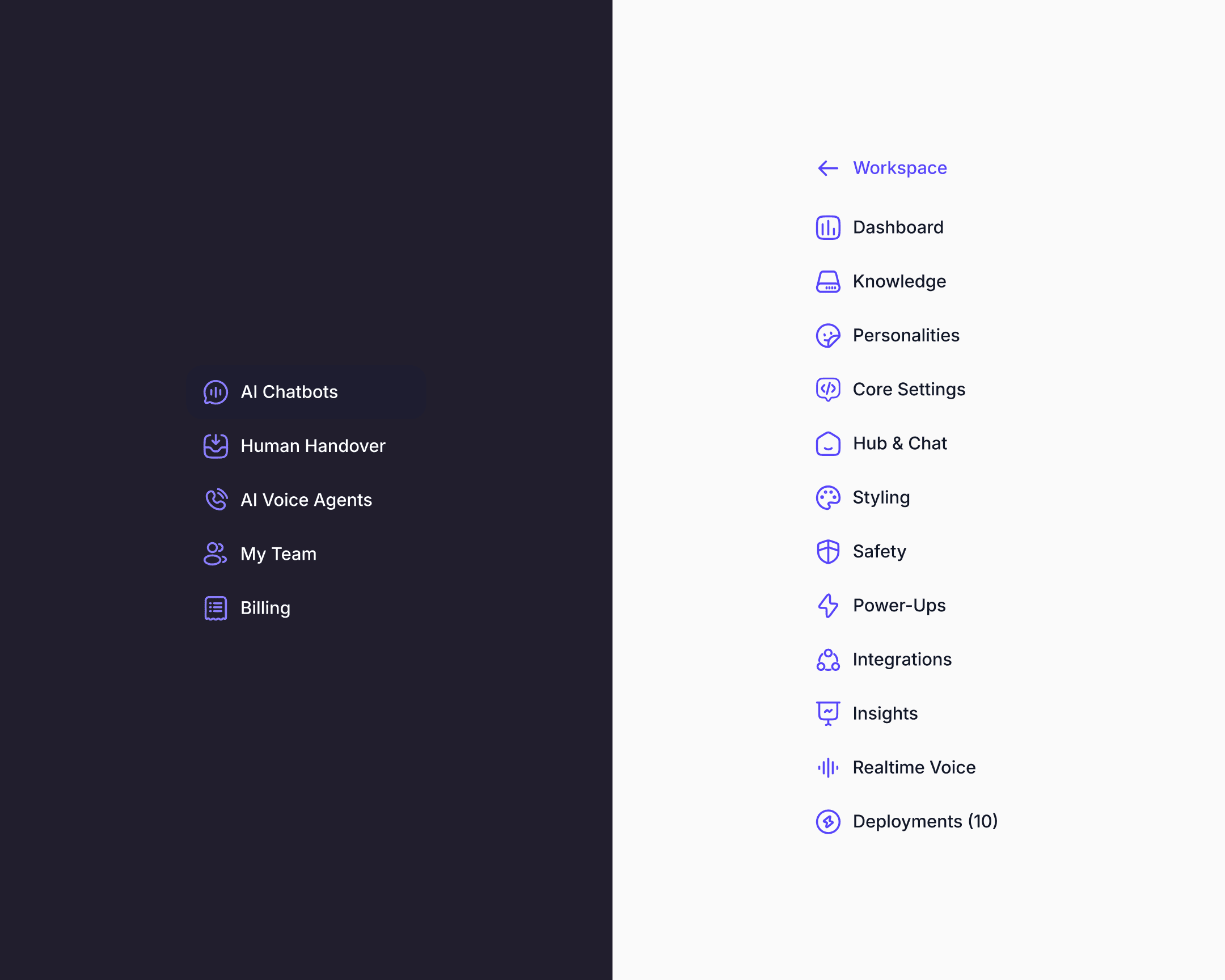
Every item in the rebuilt navigation was rethought under the same principle: promote what had been ad-hoc, implicit, or accidental into an explicit, managed, first-class object with its own model, its own discoverable affordances, and its own place in a hierarchy built to absorb features that didn't exist yet.
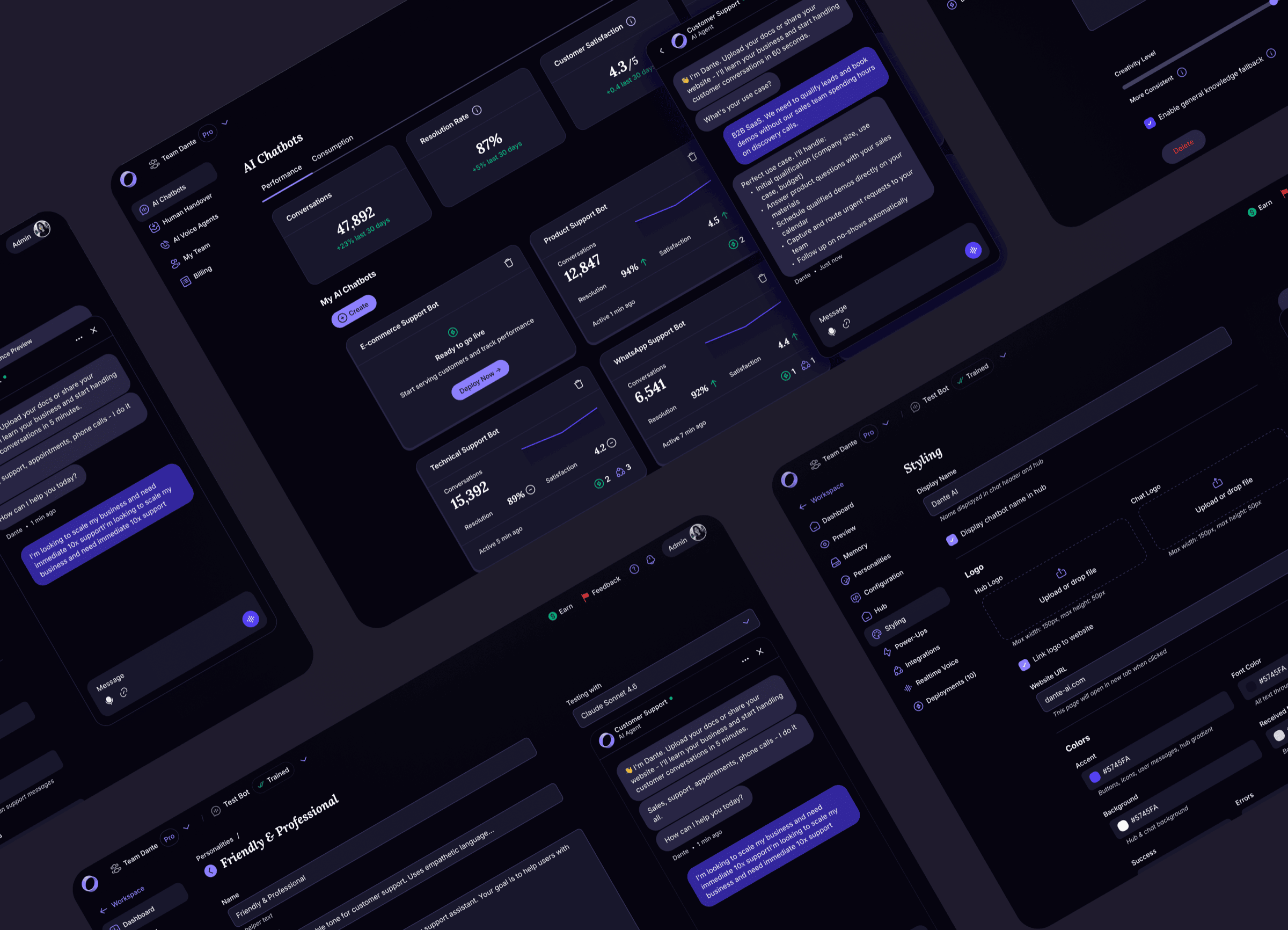
The workspace-level navigation was redesigned around AI Chatbots, Human Handover, AI Voice Agents, My Team, and Billing. Inside each chatbot, the navigation was redesigned around Dashboard, Knowledge, Personalities, Core Settings, Hub & Chat, Styling, Safety, Power-Ups, Integrations, Insights, Realtime Voice, and Deployments. Every one of these surfaces was rebuilt in this engagement.
A few examples to show the approach in practice.
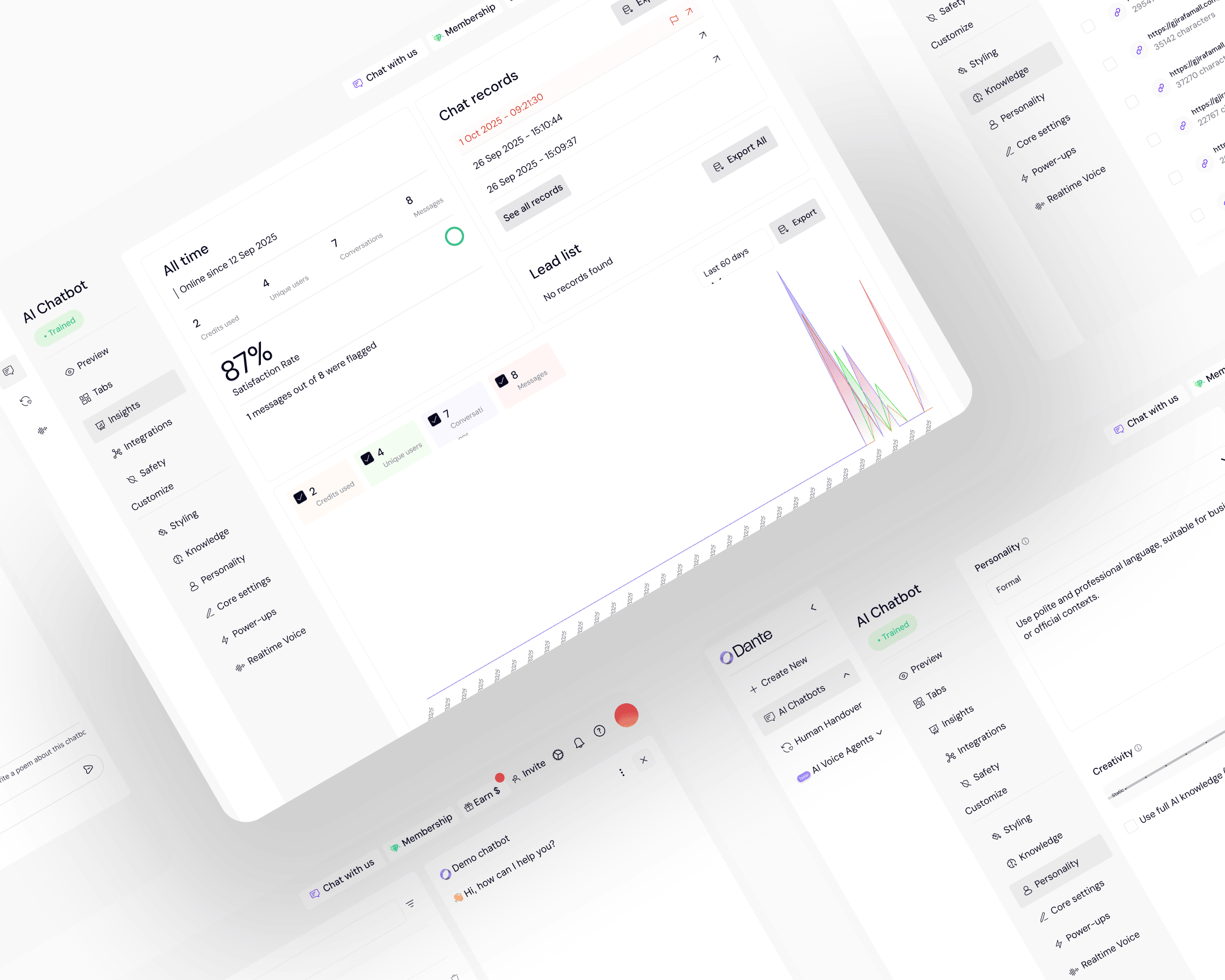
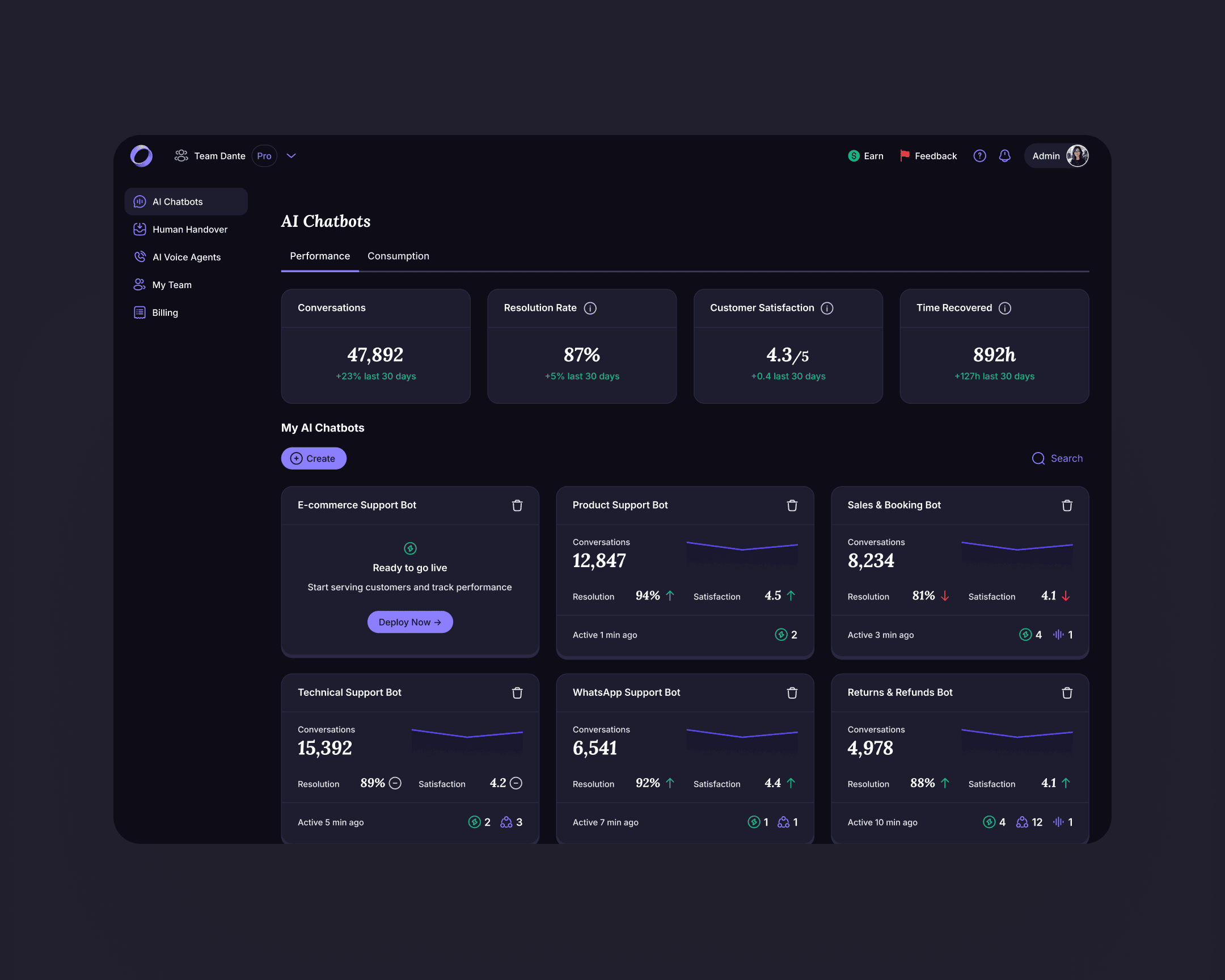
Top-level dashboard with account KPIs
Before the rebuild, owners saw per-chatbot metrics only. The new dashboard surfaces portfolio KPIs at the top of the workspace: total conversations, resolution rate, customer satisfaction, time recovered. One view per account, one scan.
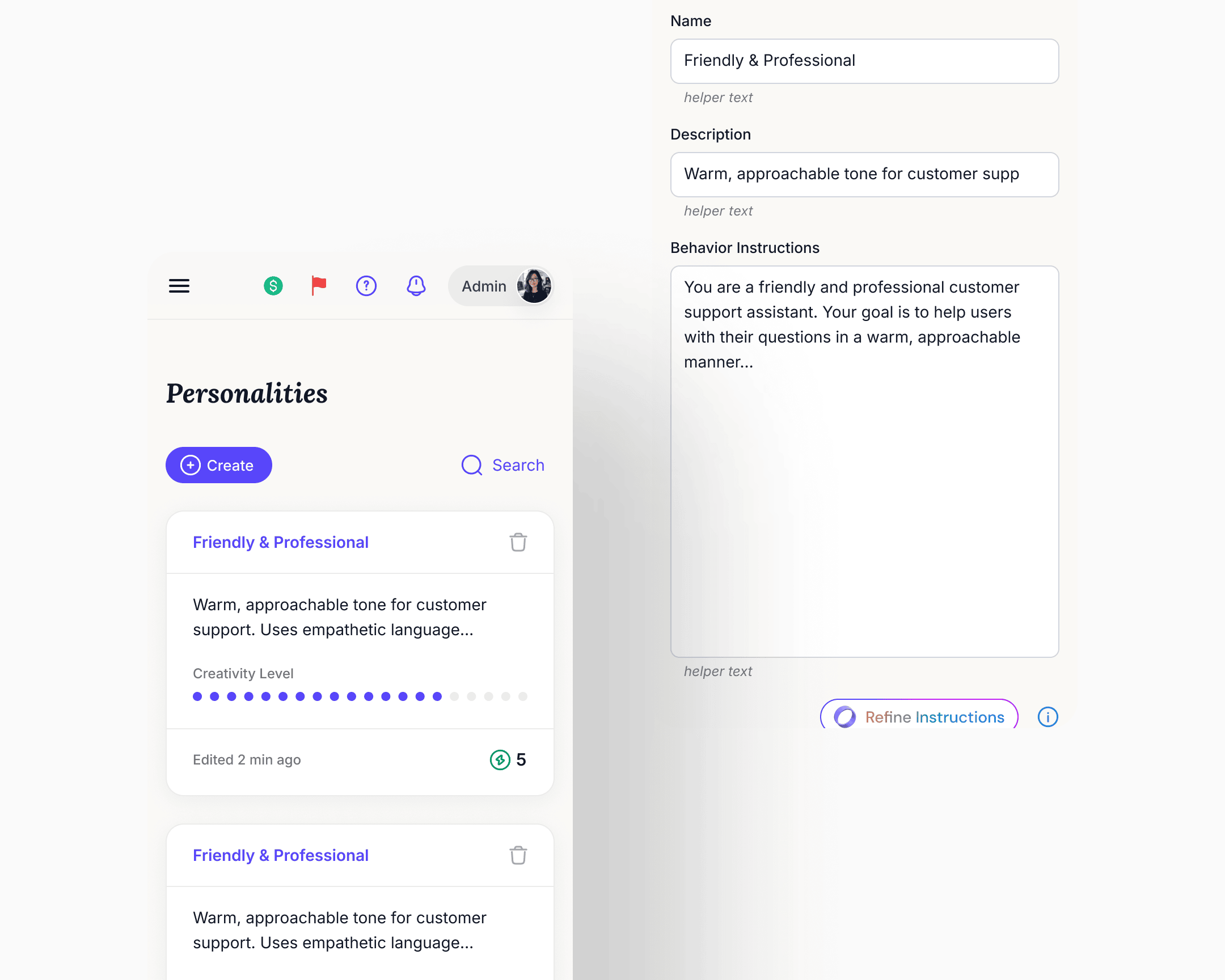
Personalities became a library
What was a single Personality form inside one chatbot's settings became a top-level reusable asset. Owners create personalities, name them, duplicate them, set defaults, and assign them per deployment. The same chatbot could run different personalities on different surfaces, A/B-test variants in production, and update one deployment's personality without affecting another's. Knowledge base and core settings stayed shared at the chatbot level.
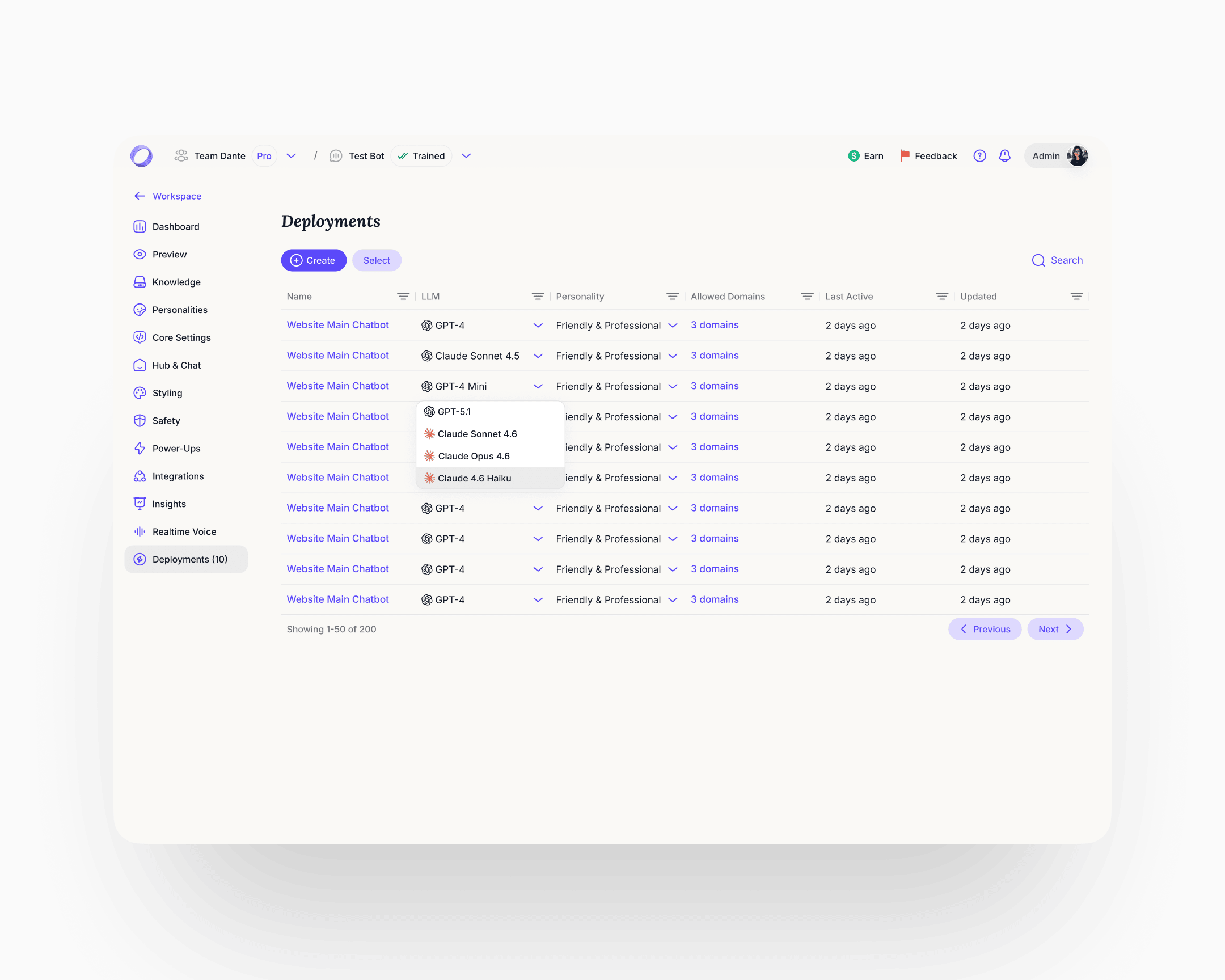
Deployments became a managed surface
Before the rebuild, every click on a Share button spawned a new deployment. Users had thousands of orphaned deployments accumulating in the background with no way to manage them, and cleanup cycles were a recurring cost. Deployments became a first-class object: the user sees every active deployment in one table, switches the LLM per deployment (GPT-4, Claude Sonnet, Claude Opus, and others), reassigns a personality from the library, and gates allowed domains. Interface and schema fixed at the same time.
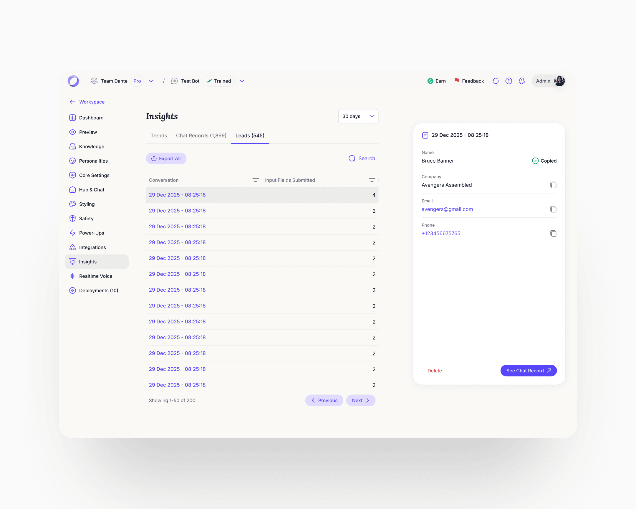
Analytics rebuilt in three tabs
Trends, Chat Records, Leads, all at account level. The Leads fix was the sharpest one. The previous implementation added a column to a flat table every time a new capture field was added, so the view would degrade as the product evolved. The rebuild made leads first-class profile objects with a fixed schema, per-field copy, timestamps, and a link from every lead back to the conversation that produced it. Chat Records gained resolution status and a satisfaction score per conversation, with the full transcript accessible from the row.
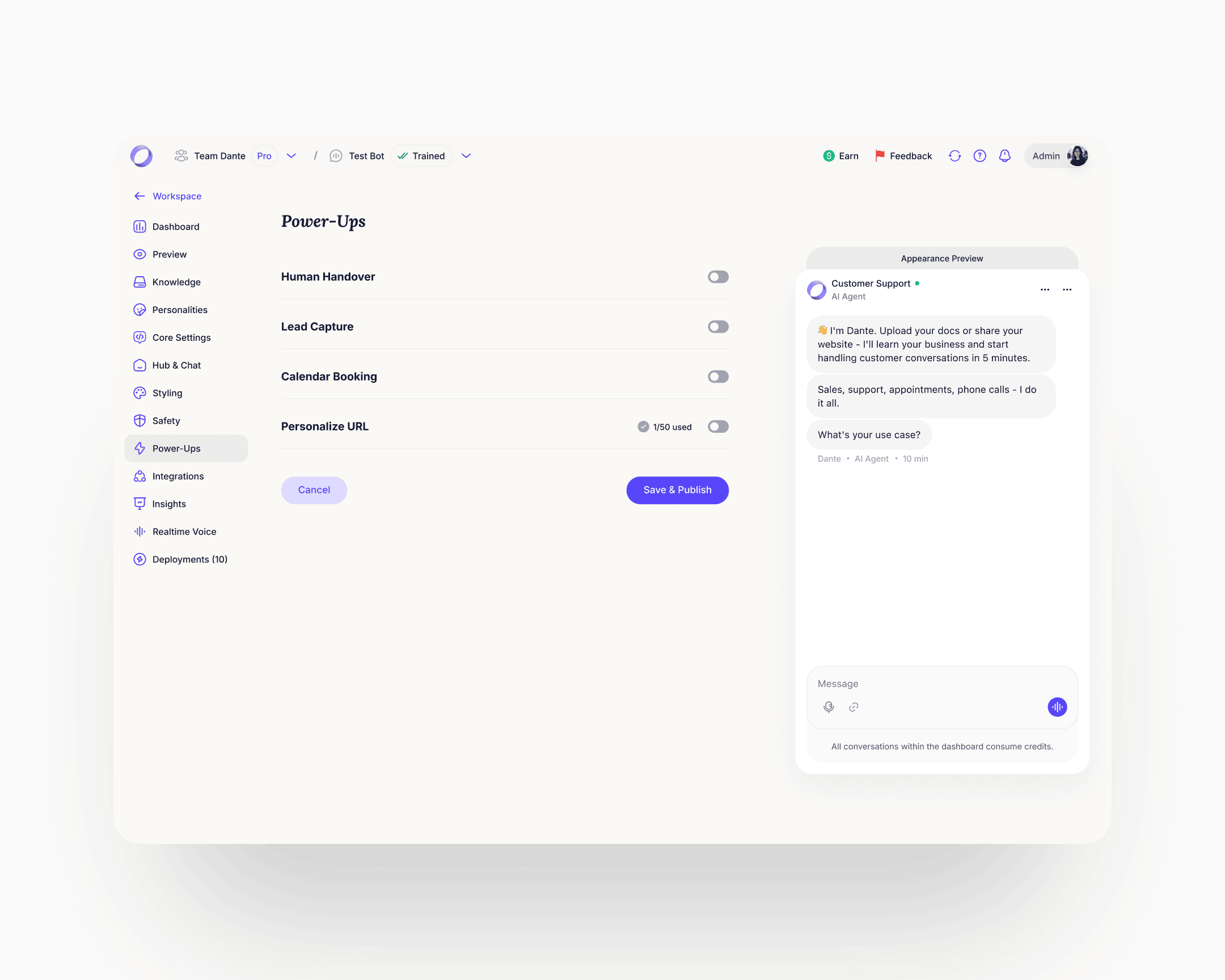
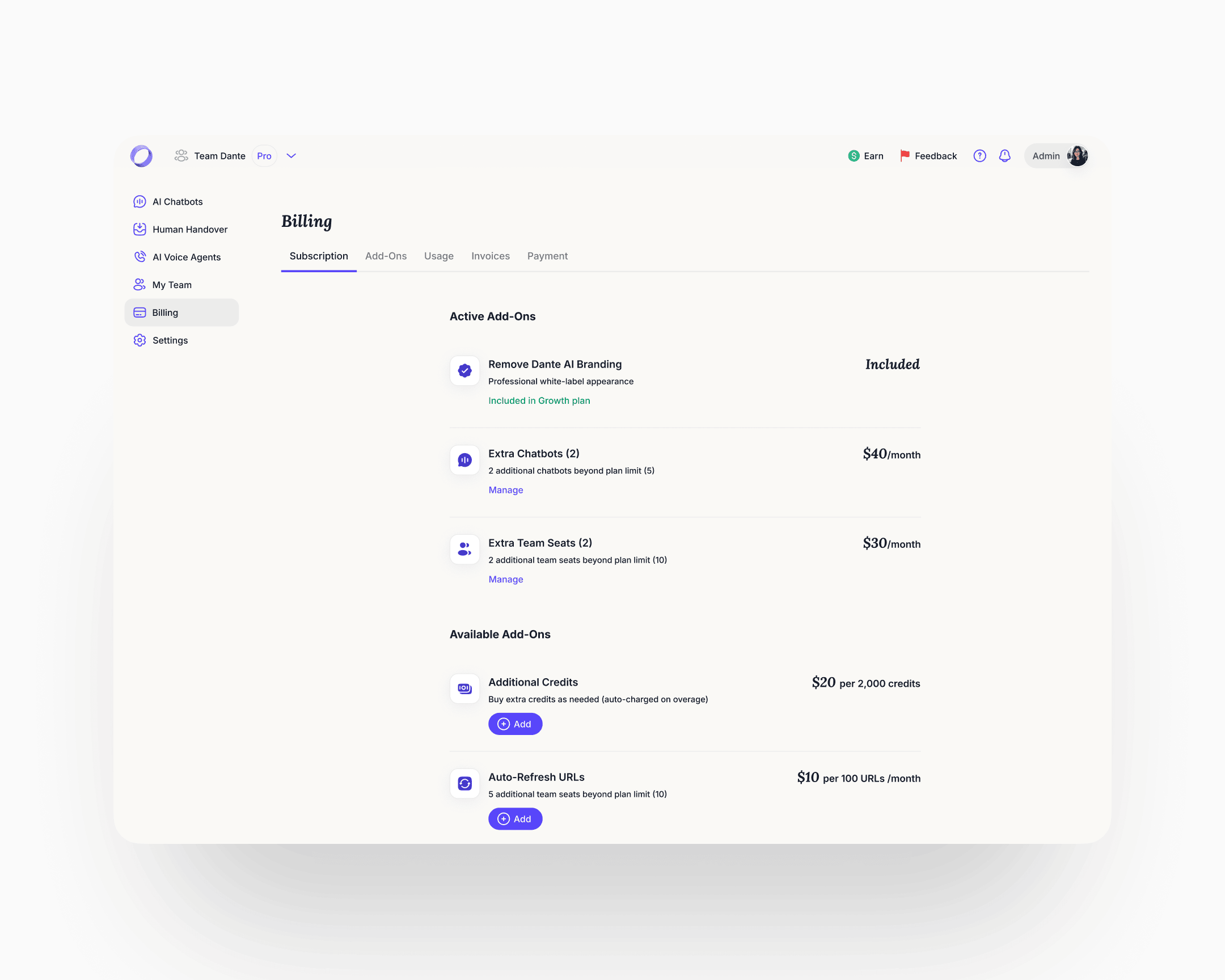
Power-Ups
The longest, densest page in the product. The ideal move would have been to split it into separate surfaces. Within the constraint of keeping it on one page, the rebuild made each Power-Up a collapsible module with its own on/off state and progressive disclosure. Rule-based triggers surfaced inline example patterns (if user mentions "refund", after X AI responses, if AI confidence is low). The Personalize URL module gained a DNS records helper with per-record copy actions. One page, navigable. Lead Capture got particular focus inside Power-Ups because of the signal from the homepage widget. The redesigned module covers granular field configuration, per-field AI prompt customisation, and rule-based triggers for when to show the capture form. Lead Generation as a user-job spans surfaces: setup inside Power-Ups, history inside the chatbot's Insights. The cleaner architecture promotes it to its own destination with Setup and History as sub-tabs, the same pattern Personalities and Deployments already follow. That class of restructure sat behind the engagement's first priorities. The system makes the lift cheap when its turn comes.
Billing
Before the rebuild, billing was an undiscoverable, broken flow. Users who needed to understand their plan or enable an add-on couldn't find a coherent path through. The rebuild introduced proper billing management with clear guidance on plan state and add-on usage. Add-ons got a discoverable place to live and a clear enable path.
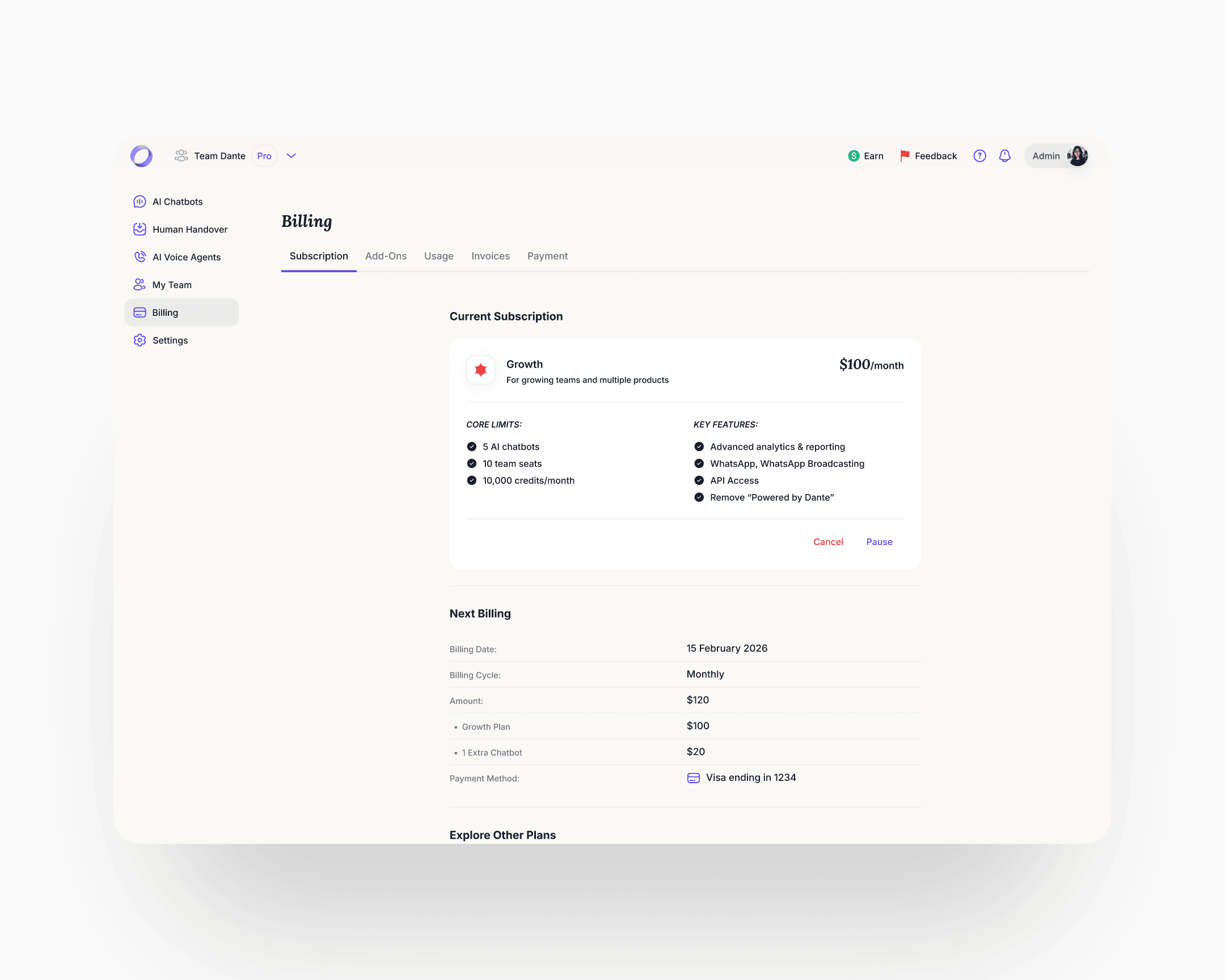
The new navigation hierarchy was designed to absorb features that didn't exist yet, and to make structural moves on the ones already there cheap. New deployment surfaces and additional integrations slotted into the same skeleton without a redesign. The work the engagement window held back, regrouping cross-surface jobs into their own destinations, splitting dense pages, lands the same way: against the system, not against every affected screen. That was the point.
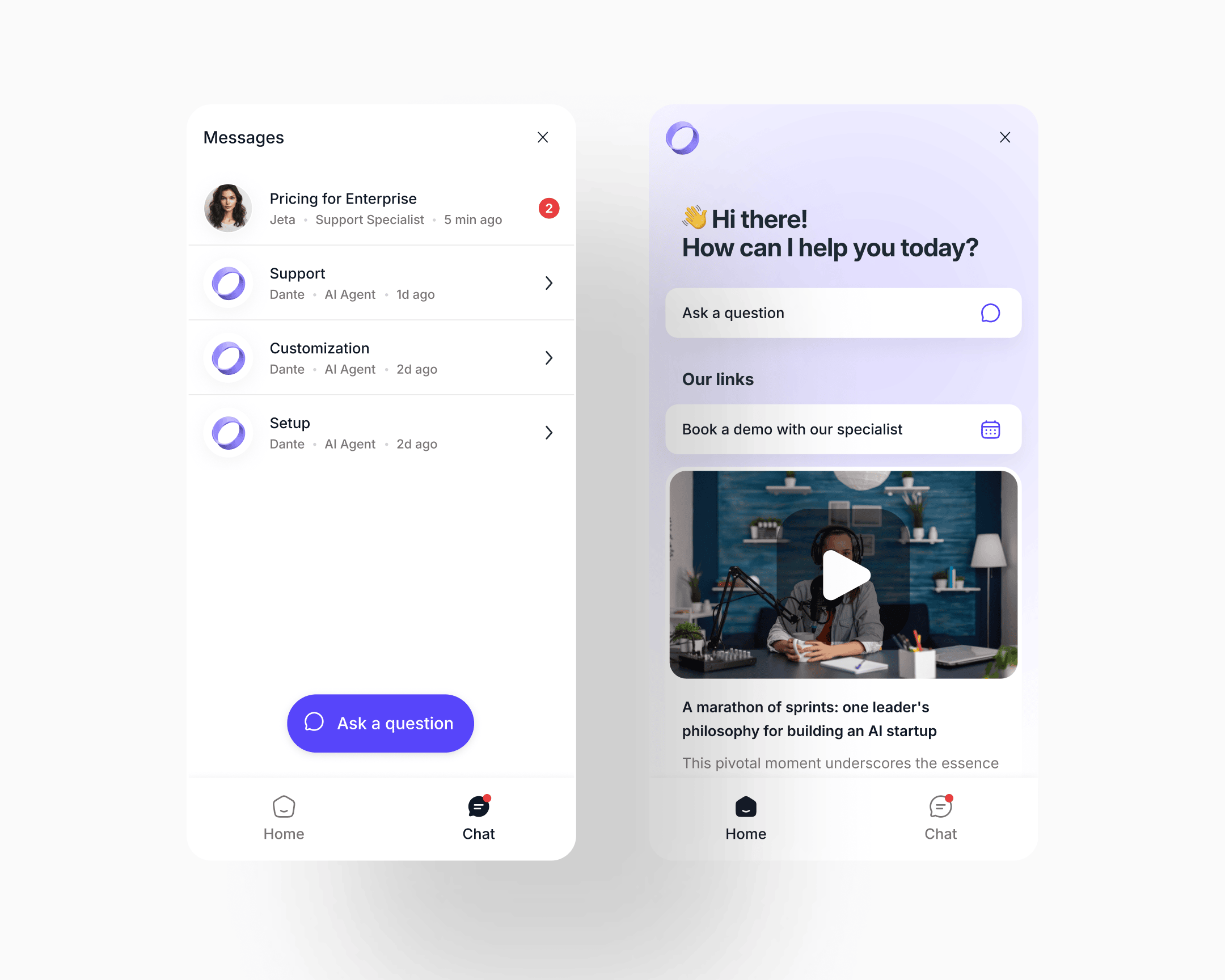
Multi-chat UI
The old widget was an ephemeral support popup: open it when you need help, type, close, the conversation is gone. No history was kept. One session was all a user got. Heavy purple gradient, limited structure.
The new widget is a persistent inbox the visitor owns. The Chat tab became a named conversation list: each thread tagged by topic, specialist or AI agent, unread count, last-active time. The same list handles AI-only threads and threads that were handed to a human, without a register shift. When a human takes a thread, it simply shows the human's name and role. The compact widget scales to a full-window expanded view when the conversation gets longer.
The conceptual move is the one that matters: the chatbot went from "help me now, close" to "my running relationship with this product."
CSAT and resolution measurement
CSAT and resolution measurement was built as a configurable layer. Owners could switch between implicit signal detection, explicit user-initiated rating, or both. The hard part wasn't the switch. It was the language the system used when implicit detection caught frustration in the transcript.
A frustrated user presented with "rate your chat 1–5" will lie or disengage. The re-engagement copy was tuned to acknowledge the frustration, offer a clear way forward, and let the honest answer emerge on its own. Implicit detection without that language is theatre.
Mobile
Mobile shipped across the whole product. Before the rebuild, mobile users hit broken screens: layouts collapsed, dense analytics views were unreadable, tables overflowed. After, every surface works on mobile with a layout tuned to the screen, not a desktop page shrunk down. The hardest surfaces were the analytics views, which required a genuine rethink of information density rather than a responsive pass.
Cancellation and churn intelligence
The cancellation flow reframed the exit question at the root.
Before, it asked "why do you want to leave", the question that triggers confabulation and defensive exits. Users who are already halfway out the door will give the most convenient answer, not the true one: too expensive, not enough time, not the right fit.
After, the flow reconnects the user to their original intent before any negative judgment forms. The questions became: why did you sign up in the first place, what do you like about Dante, what would you improve. The first question reframes the frame. The second surfaces what to preserve. The third pulls honest critique, because the user is now helping rather than justifying.
Ahead of those questions, the screen shows what the user had built: conversations handled, categories of questions answered. Achievement-first, then reflection. Cancellation data quality improved, and the categorised diagnostic feeds directly into the product roadmap.
Tokenised design system with dark mode
The design system is the reason the pace was what it was.
Dante had no system when I arrived. Components were ad-hoc, typography was inconsistent across views, colour was a palette of hex values scattered across CSS. Dark mode was technically present but unusable: surface-to-surface contrast was too low to distinguish elements, and the palette was over-saturated enough to hurt the eye during extended use. Navigation within the product in dark mode was actively more difficult than in light.
The rebuild worked from atoms up. The typography system became around eighteen named text styles (display sizes, UI text sizes, headings, number sizes), each with an explicit size and line-height pair. The colour system became semantic: tokens named by role rather than hex (Maximum contrast text, Primary text on light backgrounds, Secondary text and icons, Borders and dividers, Card backgrounds, Subtle background).
The system was dark/light mode token-based from the foundation up. Light and dark were two values against the same semantic token set, not two separate design jobs. Changing mode meant switching a small number of token values, not redesigning component-by-component. Dark-mode-specific work re-tuned surface contrast and desaturated the palette so extended reading was comfortable, but the component library didn't need a parallel version to support it.
What it enabled: engineering shipped new features without requiring design involvement on small changes. New features inherited consistency automatically. Internal design review cycle time dropped. The QA burden on consistency bugs fell close to zero. Development velocity on new features tripled over the engagement window. The structural rework still in scope (Power-Ups splits, cross-surface job consolidations) lands against the same system, not against every affected screen. That number is earned by the system, not by any single surface.
Impact
Shipped outcomes
Activation (sign-up through to first external conversation with the agent on the user's own site) moved from six percent to twenty-five percent. The lift held across cohorts for the six months following launch.
Time-to-value, measured from visitor arrival to first conversation with their own agent, went from around ten minutes to under sixty seconds. The fastest sign-up-to-annual-plan conversion the company had recorded was six minutes.
Website conversion on organic traffic stabilised in the twenty to thirty percent range, a range meaningfully above benchmarks the team had seen for comparable products. The 60-second agent as hero doubled as a marketing lever: visitors who pasted their URL and watched an agent read their site formed pre-commitment emotional attachment that showed up in conversion, not just activation.
The cancellation rewrite improved the honesty and usability of the feedback stream feeding the roadmap.
Enterprise-level inbound inquiries began coming in after the redesign, a direction the work had been designed to open.
Compounding outcomes
Development velocity on new features tripled over the engagement window, driven by the tokenised design system and its functional dark-mode treatment. Engineering now ships new features without design involvement on small changes. Internal review cycle time dropped. QA burden on consistency bugs fell close to zero. Each new feature takes less designer time than the one before it. The system compounds.
Takeaway
Endowed progress worked because the progress shown was real. That part is about mechanism. The rest of the case (production work across the website, the in-product architecture, the widget, and mobile, plus a tokenised system that took feature velocity to 3×, nine months, solo) is about what a behavioural diagnosis lets you move through when the frame is right. Get the diagnosis, and the volume stops feeling like volume. It feels like one decision, executed against every surface that touched it.