Context and diagnosis
CloudOptimal is an Azure cost-optimisation platform. When the engagement started in 2023, nothing like it existed on the market. Azure's native cost tools aggregated spend at subscription level and summarised usage at category level: useful for budget owners, useless for anyone trying to find the specific waste. VMs spun up for past projects and never deprovisioned. Disks attached to instances that no longer existed. Over-provisioned compute from old load tests that had become permanent. Organisations were haemorrhaging cloud spend on resources they had forgotten they still had.
A PM came to me with rough sketches and a clear market read: there was a product here. My job was foundational design: concept to shipped product.
I led UX as the solo designer, working with an external ML engineering team. I reported into the PM and CTO and was on every call that mattered to the product. Responsible for every design decision that touched the user.
The mechanism, once it was clear, would be loss salience. People don't act on losses they can't see. The build would have to make the waste visible: specifically, with a dollar figure attached, in a place the operator couldn't miss.
Research
Research split into two tracks.
PM-led. Market interviews with prospective cloud cost owners: FinOps leads, infrastructure operators, financial decision-makers. Opening competitive landscape on adjacent tools (Azure native cost management, generic cloud management platforms).
Designer-led. Three strands on my side.
First, extending the competitive work. The PM had mapped the adjacent landscape; I went deeper on how existing tools structured the cost data they showed and where their abstractions broke down. The common failure mode was aggregation. Tools rolled costs up by subscription or resource group, hiding the specific resources where the waste actually lived.
Second, data exploration. I worked hands-on with real Azure billing data to understand granularity and dependency from the data layer up. How cost signal actually flowed from resource through subscription to account. What was directly controllable versus derived. Where the ML-based recommendation signal (the core of the product) could live meaningfully versus where it would be too abstract to act on. The architecture came from the data, not from the UI.
Third, pilot-customer cycles. Enterprise customers ran early versions of the tool on their own live Azure data. Each cycle was a direction committed (the product's current shape), attacked from every angle and addressed concern by concern. Not "here's version A and version B, pick one." "Here's the direction, here's the rationale, where does this break for you?"
The sharpest observation didn't come from the interviews or the competitive research. It came from the tool itself, once it was running. When CloudOptimal started surfacing hundreds of thousands of dollars wasted on stale resources (VMs spun up for past projects and never deprovisioned, disks attached to instances that no longer existed, over-provisioned compute from old load tests that had become permanent) that organisations had no idea they still had, the thesis was proven. The waste had always been there. Azure's native tools aggregated it into cost totals that never made it specifically visible. The product's job was to make the invisible salient. Once it did, the savings figures spoke for themselves.
Ideation
Ideation on this engagement moved through questions, not directions. The design wasn't a choice between two or three big paths. It was a series of architectural decisions, each with several candidate answers, each narrowing the final shape. Four of those questions shaped the product most.
How should data be organised?
Azure structures information by technical hierarchy: subscription, resource group, resource. MSP customers think in terms of their own customers first. CloudOptimal committed to a customer-first hierarchy: the top-level object is the customer account, not the Azure subscription. From there, data drills by subscription, host pool, resource group, resource, desktop, user. The choice: match the operator's mental model, not Azure's native hierarchy.
How granular should recommendations be?
Options ranged from aggregate ("your storage costs are higher than last month") to per-resource-per-action ("resize these specific VMs from the current SKU to a lower SKU, based on sub-threshold CPU utilisation, and save an annualised dollar amount"). The choice committed to per-resource, per-action, with impact classification + specific resources + dollar savings + action guidance on every line. Loss salience depends on specificity; aggregate never triggers action.
What should the action path be?
Two extremes: surface waste and let the user decide, or auto-remediate (one-click resize, delete, downsize). Auto-remediation would be faster but would require write-access into the customer's production Azure. A non-starter on day one for enterprise customers who didn't yet trust the tool. The choice: surface waste with clear action guidance, leave execution to the user. The product owns visibility; the customer owns action. Trust was the constraint; the product shape followed.
How should filters work at scale?
The filter space was enormous: dozens of dimensions across domains, subscriptions, host pools, resource providers, and regions, plus thousands of possible tag values across Azure and custom dimensions. Standard pill-shaped filters at the top of the page would break the moment a user applied more than a handful. The choice: reserve the entire left rail for dynamic filters with collapsible sections, search within each dimension, and persistent visibility across every surface. Filtering isn't a decoration on top of this product. It is the primary interaction.
Other questions narrowed alongside these: how to layer historical and forecast views, how to split proactive recommendations from reactive threshold alerts, how to integrate with Azure Advisor as a signal source rather than reinvent recommendation intelligence. Each resolved in the same direction: match the operator's real workflow, not the platform's internal structure.
Execution
The expense monitor
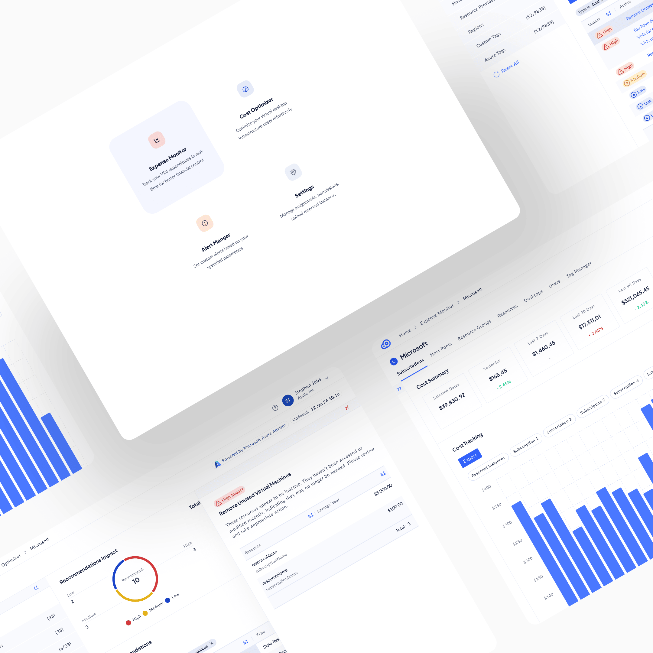
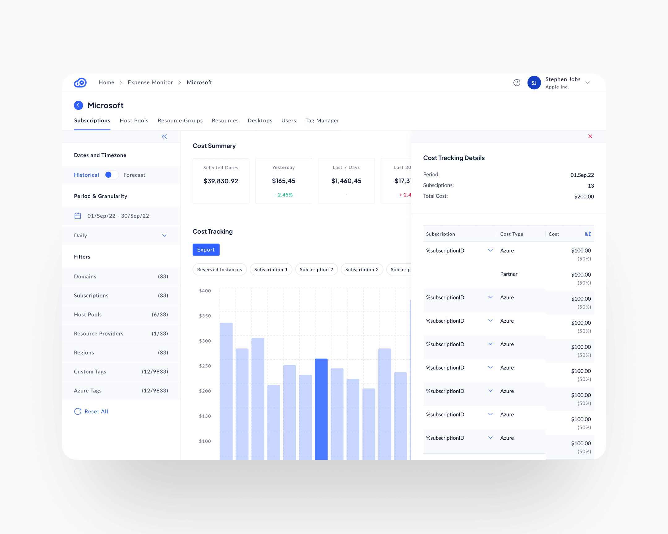
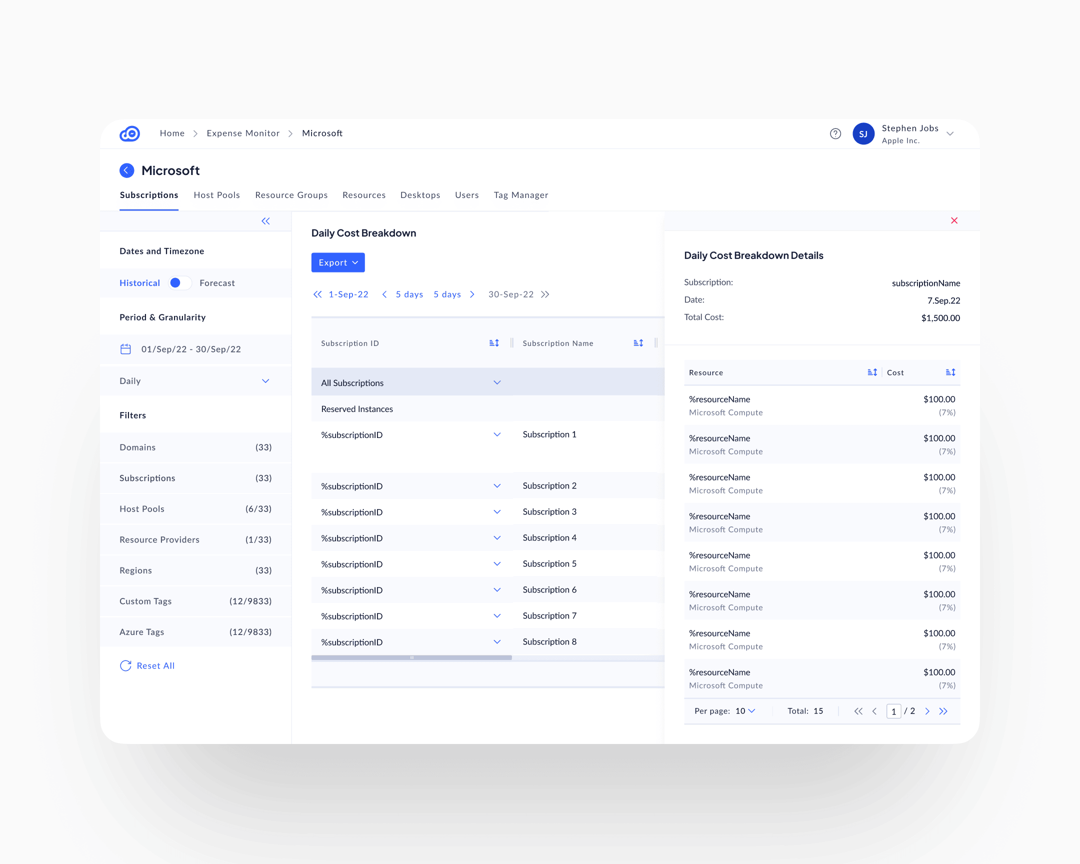
The Expense Monitor was the first module to ship. Everything else in the product was built on top of it. The premise was simple: before you can surface waste, you have to give the operator a way to see spend at the level the spend actually happens.
The surface opens at the customer (the MSP's own customer, not the Azure subscription) and exposes the rest of the hierarchy as in-page tabs: Subscriptions, Host Pools, Resource Groups, Resources, Desktops, Users, Tag Manager. The operator picks the level they actually think in. A Cost Summary row anchors the page with five comparison cards (selected period, yesterday, last 7, last 30, last 90), each with a delta against the prior window. Below it, a daily cost-tracking chart with categorical pill filters; below that, a per-row daily breakdown matrix that expands into the same hierarchy. The chart and the matrix are both interactive: clicking a chart bar opens a period-scoped detail panel; clicking a matrix cell opens a row-scoped one. The drill happens in place, alongside the surface that triggered it, not on a separate screen.
The persistent left-rail filter architecture, the Data View Mode toggle for Historical and Forecast, and the click-into-detail right panel all live here first. The other modules inherit them. The Cost Optimiser is the Expense Monitor with a recommendation layer added on top; the Alert Manager is the Expense Monitor with a threshold layer added on top. Treating tracking as the foundation, rather than as a sibling surface, is what kept the three modules coherent at the data layer and at the interaction layer.
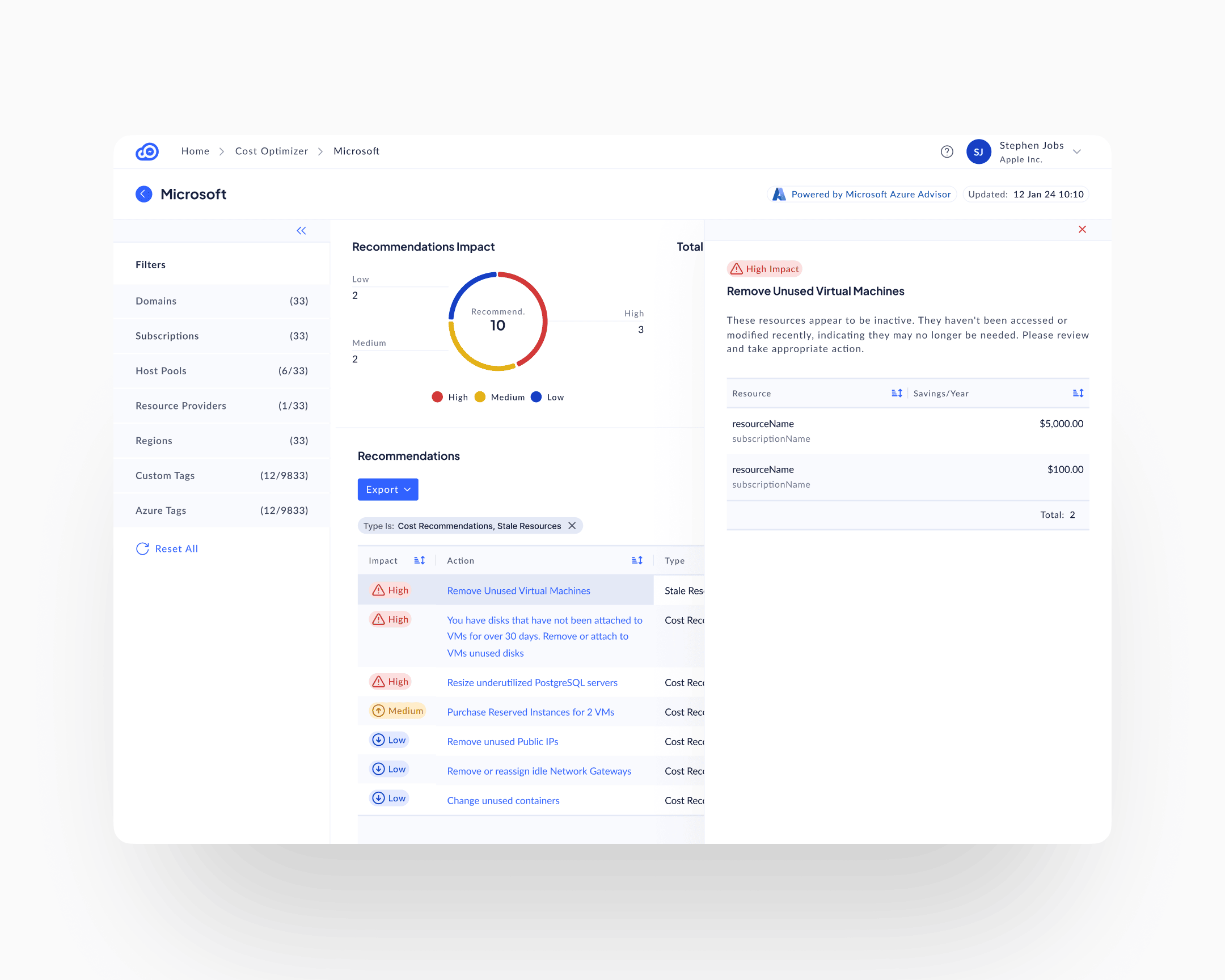
The recommendations surface
The Cost Optimiser is the Expense Monitor with a recommendation layer on top. Where the Expense Monitor shows the operator what is being spent, the Cost Optimiser shows them what to do about it. It inherits the customer-first hierarchy, the left-rail filters, and the same drill-into-detail pattern; the new ingredient is the per-line composition. Each recommendation is composed of four elements, always together, always on the same line:
Impact classification
High, Medium, Low, with matching severity iconography: red triangle, yellow up-arrow, blue down-arrow. A user scanning the list sees where to look first without reading.
Resource specificity
Not "your compute is inefficient," but resourceName in subscriptionName. Named, addressable, singular.
Dollar savings
Annualised impact, per resource. Specific enough to make the action justifiable to a budget owner at the line level.
Action guidance
What to do, not just what's wrong. "Remove Unused Virtual Machines. These resources appear to be inactive. They haven't been accessed or modified recently, indicating they may no longer be needed. Please review and take appropriate action."
This composition is what Anunta patented. The specific way those four elements combine to turn invisible waste into a specific, justifiable, auditable action item was novel enough to file on. Five design patents cover different variations of it across the product.
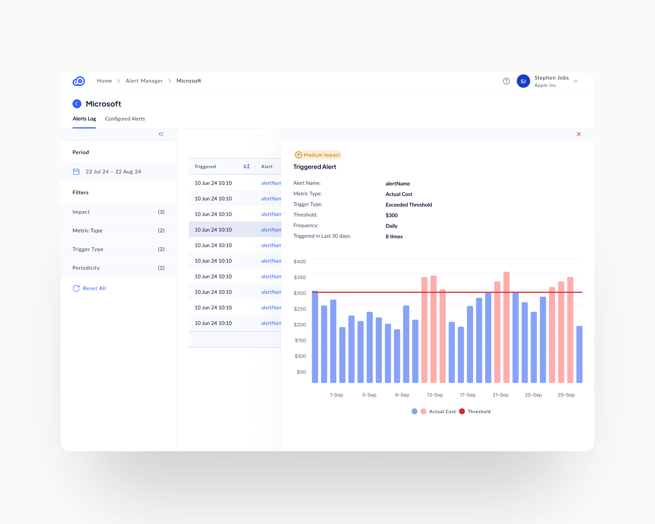
The alert manager
The Expense Monitor and the Cost Optimiser are passive surfaces. Spend and waste sit there, the user comes to find them. The Alert Manager is the active counterpart, built on the same foundation, with a threshold-and-trigger layer added on top.
Users configure threshold-based rules: alert if a chosen metric (actual cost, forecast, anomaly) exceeds a configured threshold at a configured frequency. When a threshold is crossed, the surface fills with the triggered alert, a visual of which days crossed the line (red bars above threshold, blue below), and context on how often the alert has fired in recent history.
Two mechanisms for loss salience running in parallel. The recommendations surface catches structural waste: stale resources, over-provisioning, unused capacity. The alert manager catches anomalies: spend spikes, trend changes, threshold breaches. A customer who uses only one misses half the signal.
The dynamic filter rail
A single enterprise customer account could have dozens of domains, subscriptions, regions, and host pools, plus thousands of possible tag values across Azure and custom dimensions. Pill-shaped top-bar filters would have broken on that scale before a user finished their first selection.
The left rail became the filter architecture. Each filter category (Domains, Subscriptions, Host Pools, Resource Providers, Regions, Custom Tags, Azure Tags) collapses or expands independently. Each has search within. Each shows its current selection count against the total available. The rail is persistent across every surface in the product, so filtering follows the user through Cost Tracking, Recommendations, Alerts, and Tags Explorer.
The constraint was data volume. The design response was to move filtering from transient (pills, top bar) to persistent (left rail), and accept that filtering is the primary interaction on this product, not a decoration on top of it.
Historical and forecast views
A Data View Mode toggle in the left rail switches the whole interface between Historical (what has been spent) and Forecast (what will be spent, based on current trends). Same UI, same severity indicators, same filter rail. Flip the switch, the data horizon changes. Users who come to audit past spending use Historical; users who come to plan use Forecast.
The pattern is the same behavioural move as temporal navigation in EuVantage: move time from a filter to a mode. Different application, same underlying design logic.
The design system
The CloudOptimal design system was built by me and implemented by an external engineering team. Tokens, layout primitives, component library, interaction patterns, severity semantics: the whole foundation, before the first surface was built in code. Without that, a product with this many dimensions and this much data density would have fragmented into surface-level inconsistency in the first three months.
Impact
Shipped outcomes
Customers reduced cloud spend 31 to 80 percent per account, averaging 35 percent. The percentage held across customers of every size in the pilot cohort. Absolute savings scaled with the customer's Azure footprint, because the waste scaled with it.
Adoption reached 95 percent plus. In a category where industry-standard behaviour is abandonment within weeks of purchase, adoption this high is the product outcome that matters most to the business. High adoption means customers use what they pay for, renew, and refer.
Sales velocity followed. Prospects understood value immediately during demos. The product's surfaces show savings opportunities without requiring training. Clean visualisation accelerated purchasing decisions; stakeholders convinced themselves.
Design IP
Five design patents secured on specific data-visualisation compositions: the way cost signal, waste identification, and recommended action combine into single-surface views. The patents protect a composition model that didn't exist in cost-management tooling at the time.
Takeaway
Loss salience made operational. The specific composition that moves behaviour is: specific resource + specific action + specific dollar impact + impact classification, all on the same line. Remove any one of those four and the user returns to reading reports. The 31 to 80 percent cost reduction range and the 95 percent adoption are both downstream of that one compositional choice.
Invisible waste doesn't stay invisible once you know how to compose the signal. The product's job is to compose it: specifically, in a way the user can't pretend not to see.